With version 7 of Midjourney having a completely different sref library (“–sv 7” vs “–sv 4” for the prior versions), I’ve jumped to a totally random location (69000) and curated the 69000-69999 series ending up with 87 unique style references. sref 69000
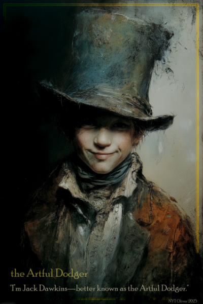
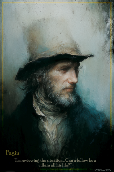
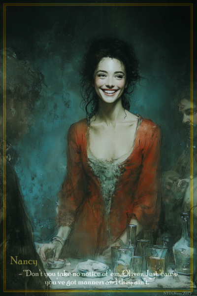
For the most recent set of character posters (for NYT’s “Oliver” musical), I used the following three style references (–sref 69085::2 69377::2 69244::1) from this series to produce a consistent set of posters (3 of 12 shown here).
sref 5000 usually creates a vector type graphic with a lot of purple aspects to it. With people or some objects it will often be more of a picture/photo with an arabesque/swirly purple design somewhere. I don’t really enjoy the picture versions that it come up with, but really like the images that are more abstract.
Midjourney v7 brought with it a whole new set of style reference (meaning that sref 5000 on v7 is very different from sref 5000 in v6.1). So, to utilize it, you’ll have to either be using v7 (probably on by default) or specifying v6.1 and sv 4. (“–sv 6.1 –sv 4”).
Yes, a row of cats (okay, I admit, I just wanted some text between rows of pictures).
I’ve completed the curated visual catalog for Midjourney v 6.1 srefs in the 3000-3999 range. Available under the MidJourney Resources menu above or at this link (sref 3000-3999). Bu curated, I mean that I limit the displayed srefs to the ones that I find interesting. This usually results in only about 20% of the style references making the cut. If you want to see complete sets – look at the ones in the 0-600 range.
To facilitate projects with black and white AI images, I’ve put together a reference page with 276 robot pictures in all sorts of black and white style references. This is the majority of monochrome style references in the version 7 styles in the range from 0 to 2499. 276 Black & White Robots
I’ve been wanting to get all of the show posters on the website. Some of the early ones were true works of art – digital art created on her computer/iPad by our artist daughter Mikaela. All of this is available from the “Show Posters” menu at the top, or this link right here: Show Posters
For space and responsiveness, the posters as posted are not full size. If you want to see them bigger you can zoom in with your phone, or use Ctrl+plus (or minus to zoom out) on a web browser.
If you want a free copy of a specific poster, email me at hubcrate@gmail..com. If you want to pay for a digital copy, same thing. If you just want to enjoy them, enjoy them.
This is a “study” (investigation, adventure, trip down a rabbit hole?) into Midjourney style reference 2008. Captions used on the pictures are the text description provided for image generation. Typically (in my experience), the simpler the description, the “truer” to the style reference the images are.
For an initial analysis of style references, I’ll typically use the Midjourney “describe” command to provide a textual description of a number of images in the style. In this case, a common part of the description was that it was in the style of Disney cartoons. So, we’ll run with that as part of the description.
Jalopies racing on a dirt roadVehicle
Color Palette
Dark blues and grays primarily, but there will almost always be a red accent.
Style
Digital image, cartoonish but with well blended features.
Racial Characteristics
People portrayed will typically be slim, dark haired, primarily Asian. This can be over-rules by the prompt, as a couple of the “Disney Princess” prompts produced blond and red-haired princesses.
Blending
Multiple copies of an object tend to be identical, whether this is cars, trees, or cloud formations.
AstronautPilgrimMarkeplaceJack of DiamondsCaptain Bintuna of the Farline Starfarers GuildPrincessCaptainMarketplaceSailing Ship
sref 3084 has a number of interesting features as detailed below. The captions on the pictures are the text used to generate the image, for the most part being very simplae and allowing the style reference to show its inherent biases.
Setting
For the most part, image settings are during the age of sail, possibly the golden age of the British Empire, all seen through a golden lens of nostalgia. The description of “Captain” results in a sailing ship. Buildings likewise are from a similar era. From the presented images, only the “astronaut” one would be slightly modern.
Color Palette
The predominant color is that of parchment, but overall the palette leans fairly heavily into pastels.
Focus
Typically the bottom of the image will be out of focus, having somewhat of a blur effect.
Artifacts
The style reference often adds faint background artifacts to images that are relevant. In the “captain” image, a sailing ship is added. On the “sailing ship”, a compass rose is added. Often times there is a border added (see “Jack of Diamonds”, “Sailing Ship”, “astronaut”) which is often in faint gold.
NYT Studio asked me if I would put together class graphics for display during the spring recital. I had done the same project for them last year, so had a pretty good idea of the process and workload. Overall, the goal was to put together a quality set of images at the correct resolution (1920 x 1080) for display. Some of the images would be ones that individual teachers had provided, while the rest were images that I created based on a short description from the teacher or possibly a link (“something like this image”). I also knew the song name, so could do some additional research there if needed (and I had the time).
For images provided by instructors, I had to make sure they were cropped to the right aspect ratio (16:9) and were the correct resolution. Some were pretty small and had to be scaled up to the correct size. For this I used Topas Gigapixel, a tool that uses AI to scale up the resolution of images.
For all of the images, I also had to provide the titles. This was a combination of a number of factors, including: scrolling through a lot of fonts to find one that I felt matched the picture, determining where on the picture to have the title, choosing a color for the font (typically sampled from a color on the image that contrasted with the background), and then applying one or more effects to make the font stand out (3D effects, shadow, glow, etc).
With images that I created, I tried to supply the instructors with 4 images to choose from that fit the description. This was a challenge, as I wanted the four images to be distinctly different from each other, rather than four slight variations on a theme. This often took quite a bit of pondering, imagining (what do I want this to look like) wording changes and image creation. In the end, most classes had four to choose from, a couple only had three and some got five when I got carried away with it. My goal was to provide such good sets of images that it would be hard for them to choose. I don’t know if that ended up being the case, but it was a motivation for me.
Once everything had been decided on (this might have been the night before the recital, but I’ve conveniently forgotten now), it was time to pull it all together for the production. Renaming the files by recital order was key to keeping them organized, as there was 39 class performances. I saved them all to a thumb drive (but also had my computer along for backup and last minute changes) to take to the recital. At the church, we used their projection system and software (Pro Presenter) and loaded in the songs. I got to hang out in the tech booth and run the slideshow, determining when to turn the next one on (generally as soon as the dancers were all on the stage, hopefully just about in position), and then fading out when songs ended.
With the projection screens are on either side of the stage, I felt that it added a fun environment and context to the dance and vocal numbers. The focus was on the kids, but the graphics (I felt) added a sense of professionalism and imagination to the recital. If you get asked to do this project next year, give yourself a lot of time and try and stay organized.
Here are the rest of the images that I put together.
I’ve posted a new visual catalog page of the curated style references in the 2000-2999 range. My goal was to whittle the initial 2000 srefs down by 80% and only present the unique ones (that interested me). I made it down to 202 presented srefs.
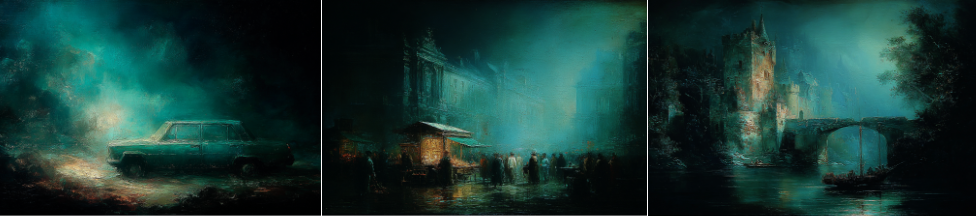
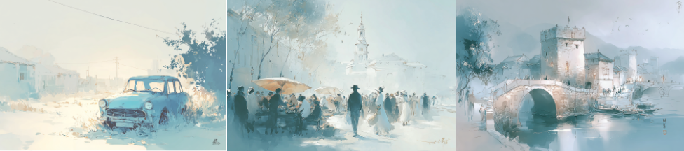
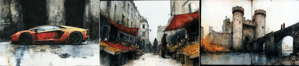
This is about the 12th set of srefs that I’ve created, the initial 1000 being done in sets of 100. I have tried to present four different subject matter domains (for lack of a better term) for each style reference, keeping it consistent across this set. The first two (couple, i.e. man and woman, and car) have been pretty consistent. I wanted an architectural one, so in this case used “watchtower and bridge” as bridge by itself can be a bit boring. In the past I typically had the fourth image be a famous city, but for this set, chose an object: “animated chess knight on a chessboard”.
For each of the style references, I originally generated two sets of pictures: “vehicle” and “man and woman dancing” (this one as a result of a project for a Project Dance fundraiser).
I then reviewed each style reference and created a list of srefs that were interesting. For each of those (about 210), I created four sets of images (couple, car, bridge, knight). From each of those sets of images, I generated an image that I considered representative of the style. These were then run through a couple of additional processes to get to the visual catalog as presented on the website.
There are a handful of style references in this series that I would like to study more indepth. They include the following: 2008, 2010, 2012, 2023, 2074, 2136, 2273, 2275, 2283, 2339,2481, 2814. At one a week, that would take me 3 months, so we’ll see to what degree that happens.